

I chose this photo today to convert to black and white as I thought it had a sort of old world feeling. The children, especially the little girl, are dressed in the fashion from an earlier age, and I wonder if that is a picnic basket or is mother collecting something.
I don’t usually think landscapes look better in monochrome, so I am putting in the original to see what you think.
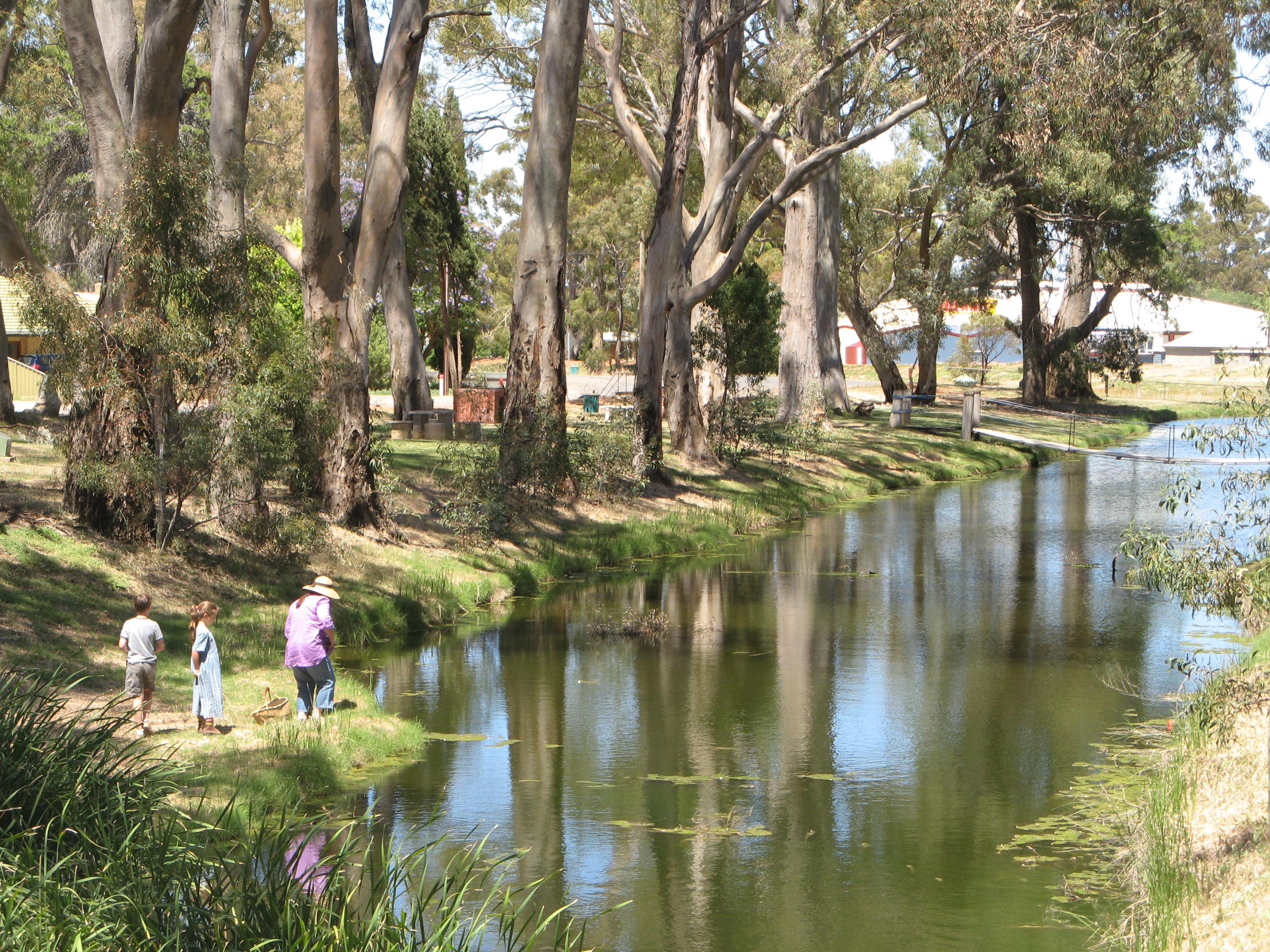
I also cropped out the bushes on the right hand side to bring it more into line with the rule of thirds.
*****************
Gwennie of “Gwennie’s Garden” has invited me to join in. I love to visit Gwennie, her blog is filled with gorgeous photos of flowers and succulents from her garden and interspersed with stories of her travels. Well worth a visit.
There are only two rules for this challenge:
1. On 5 consecutive days, create a post using either a past or recent photo in B&W.
2. Each day invite another blog friend to join in the fun.
Today I would like to nominate Jude of “Travel Words“ to join in. Of course this is only if you have the time and want to.
Jude has travelled extensively and she takes us with her on her journeys in both words and photos. Not only does she do that but she hosts a “Bench Series” challenge and has a second blog devoted to her passion in plants, “The earth laughs in flowers”


Hi Pauline, I prefer this one in black and white. Love it.
LikeLike
Thanks for the feedback Jane
LikeLike
I think the black and white version is the best, too. I think it shows the play of light more somehow. I can see I am going to learn a lot form this challenge, Pauline.
LikeLike
I have become a bit of a concert to the b&w will probably use it more often.
LikeLiked by 1 person
they are both awesome pictures !
LikeLike
Thanks Gwennie, I enjoyed this challenge, thank you for nominating me
LikeLiked by 1 person
and thank you accepting !
LikeLiked by 1 person
Mature people? What can Jack mean, Pauline? 🙂 We’re all young here. This is another ‘natural’ for black and white. Properly ‘old world’, but I wasn’t around then, honestly!
LikeLike
Of course we’re all “young” (at least in spirit!!!) Jo, that was our parents era (saying with tongue firmly in cheek) actually it was, I was a rock-n-roll teen not a flapper…
LikeLiked by 1 person
This photo will take many on a trip down memory lain.
Most mature people (oldies) will recall a scene like this.
LikeLiked by 1 person
I can not make up my mind. One the one hand, I like the BW one because it looks old world. On the other hand, I like the colour one because it has brought sunshine to my wintery dark corner of the world.
LikeLike
Thank you for your comments, we are lucky to have digital images to play with, then we can have the best of both worlds. Pleased to bring you a slice of sunshine
LikeLiked by 1 person
I like them both. They have very different feels. I’m doing this challenge, too. Fun, isn’t it?
janet
LikeLike
Thank you Janet for commenting. Yes it is fun and being only 5 days it does not get boring…
LikeLike
It’s really enjoyable to work with B&W and see which photos word well. So easy with digital!
LikeLike
I agree
LikeLike
lovely picture !
LikeLike
I love the B&W version, Pauline. It really does look from a bygone era. Beautiful reflections. 🙂
LikeLike
Thank you Sylvia
LikeLiked by 1 person
Totally different effects in the two versions, but the reflections are the stars in both. B&W is far more evocative.
LikeLiked by 1 person
Yes it was the reflections that originally caught my eye when I took this photo.
LikeLike
Both versions work well. I love the colour version with the bushes (they frame the river). It has a painterly feel about it and the trees are very distinct. The black and white version looks as though it has come out of an old book – the light catches the family in this version.
Thanks for the invite – I shall do my best!
LikeLike
Thanks for your input Jude. I’m liking this image more and more and I am thinking of trying to do a painting of it.
Thank you for taking on the challenge, I think you will enjoy it, I’m finding it to be a learning curve and giving me an opportunity to revisit my old photos.
LikeLiked by 1 person
I hope you’ll like what I have selected 🙂
LikeLike
I’m sure I will, I look forward to seeing it. Which blog will you put it in?
LikeLike
Travel Words – although there may be some plant life 🙂
LikeLiked by 1 person
I like both versions but, what is interesting to me is that I see things in a distinctly different way with each version. In the color photo, the background building immediately draws attention and distracts focus from the river and trees (but I love the dress color). In the b & w, the building blends into the background, and the river, trees, and people become more important. I’m glad you included both for contrast.
LikeLike
That is a very interesting observation. I see what you mean, I hadn’t noticed it before, but yes the red of the bbq does jump out in the colour version, especially as it is so central, and then blends with the trees in the b&w.
LikeLiked by 1 person
although it looks more atmospheric in B/W I think it has a look of a John Constable painting in colour, so I prefer the colour version.
LikeLiked by 1 person
That’s interesting Sandra, Constable is one of my favourite painters, maybe I should try painting this scene!!!
LikeLike
Always like the B&W imagesâ¦.
Jackie Carroll |Compliance & Management Systems
m +64 21 342766
[Description: D:\TRANZLIQUID ADMIN\TEMPLATES\logo-tranzliquid.bmp]
The bulk petroleum logistics experts
Right product, right quantity, right tank – ON TIME- GUARANTEED!
Web |www.tranzliquid.co.nz fb |facebook
LikeLike
Good to hear from you I am enjoying the photos you are putting on FB. Look forward to seeing more in a few weeks time… 🙂
LikeLike
A great photo and agree it is even better in B&W. This is an excellent challenge. I am currently choosing some photos for an upcoming book and these have to be in B&W too. What has quickly become apparent is that some of the colour ones that in would have chosen do not look so good in B&W. Quite a challenge!
LikeLike
G’day Wilbur, I appreciate your feedback on the photo. I agree it is not easy to find colour photos that convert to b&w I spent a very interesting and pleasurable few hours searching through all my files trying different images for this challenge.
Would you be interested in taking part in this 5 day challenge? If so I will nominate you tomorrow in my next post.
LikeLike
Hiya – yes would be happy to do it if you nominate me. Thanks. Wilbur.
LikeLike
Good one. I will nominate you later today when I do my next post.
LikeLike
I love both pictures but somehow the black and white does speak more to me in this case.
LikeLike
I’m so pleased to hear that. Thank you for letting me know.
LikeLiked by 1 person
I think it looks better in black and white, nostalgic, but I actually prefer the bushes, rule of thirds or not!
LikeLike
Now that is interesting . I couldn’t make my mind up about the crop so thought I would show a before and after. Thank you for the comment Gilly.
LikeLike
I acutally like it better in black and white!
LikeLike
Thanks Cindy I’m pleased to have your feed back…
LikeLike